30 Day Chart Challenge 2024
This year, I took part in the exploratory, yet excitingly creatively demanding #30DayChartChallenge—a yearly event that brings practitioners of data visualization from across the globe into a daily 30-day exercise. This year’s challenge has helped me churn out nine different charts; each one offers me another tool with which to tell my data story. Here is a closer look at how it went, the tools used, and some insights collected along the way.
Getting Started
The #30DayChartChallenge is designed to push participants out of their comfort zones, as each day comes with a theme. Participants are, therefore, challenged to think outside the box and find a way to explore different aspects of data visualization within a single overarching theme. I didn’t finish the thirty days, but the 9 charts I came up with were enlightening about the versatility and power of modern data visualization tools.
Tools Used
These are some of the primary tools I’ve been experimenting with during this challenge, among others. Each one has its strengths and unique capabilities:
R: One of my go-to solutions, including making complex data manipulations with customized plots—R is known for statistical prowess and flexibility.
D3.js: Every time I need interactivity and dynamic visualizations that might require control at every item level, D3.js to the rescue.
Datawrapper: Every time I need to whip up a chart that’s clean, responsive, with minimal turnaround time, I do it on Datawrapper.
Tableau: To make nice and clean visualizations, which are generally highly designed and can tell a story—I use Tableau a lot, especially for dashboards.
Takeaways
Each tool has its strengths; some of these are mentioned here:
R: Unbeatable for statistical analysis and tailor-made plotting.
D3.js: For precision and interactivity that is unparalleled.
Datawrapper: Great for quickly creating publication-ready visuals. That complex data became possible with the use of dashboards and, subsequently, interactive elements.
All My Charts
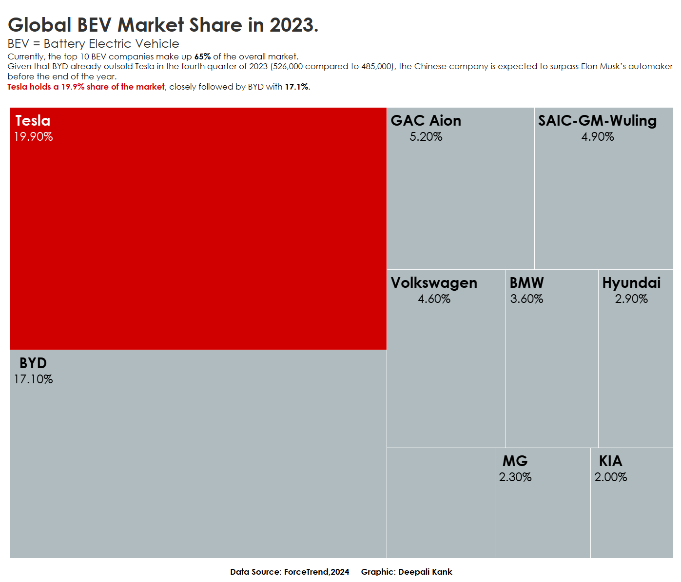
1. Part to Whole
2. Makeover
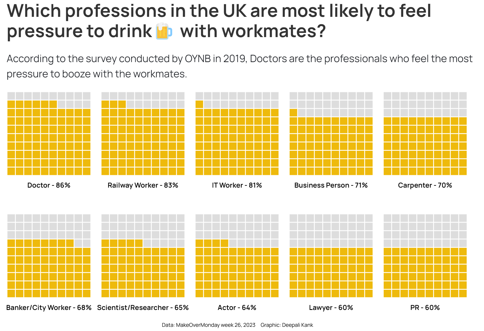
3. Waffle
4. Diverging
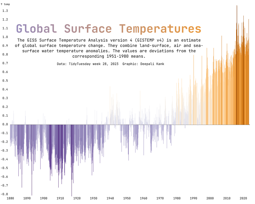
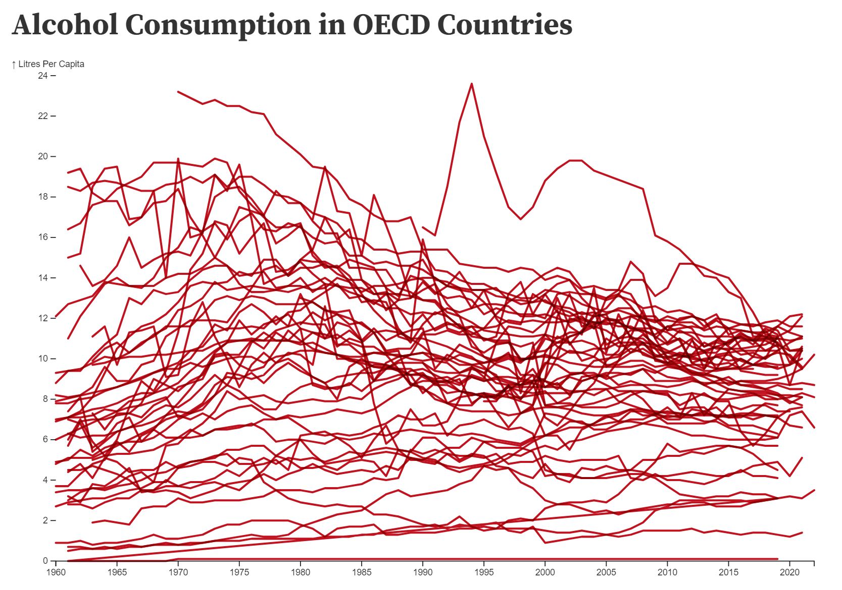
5. OECD
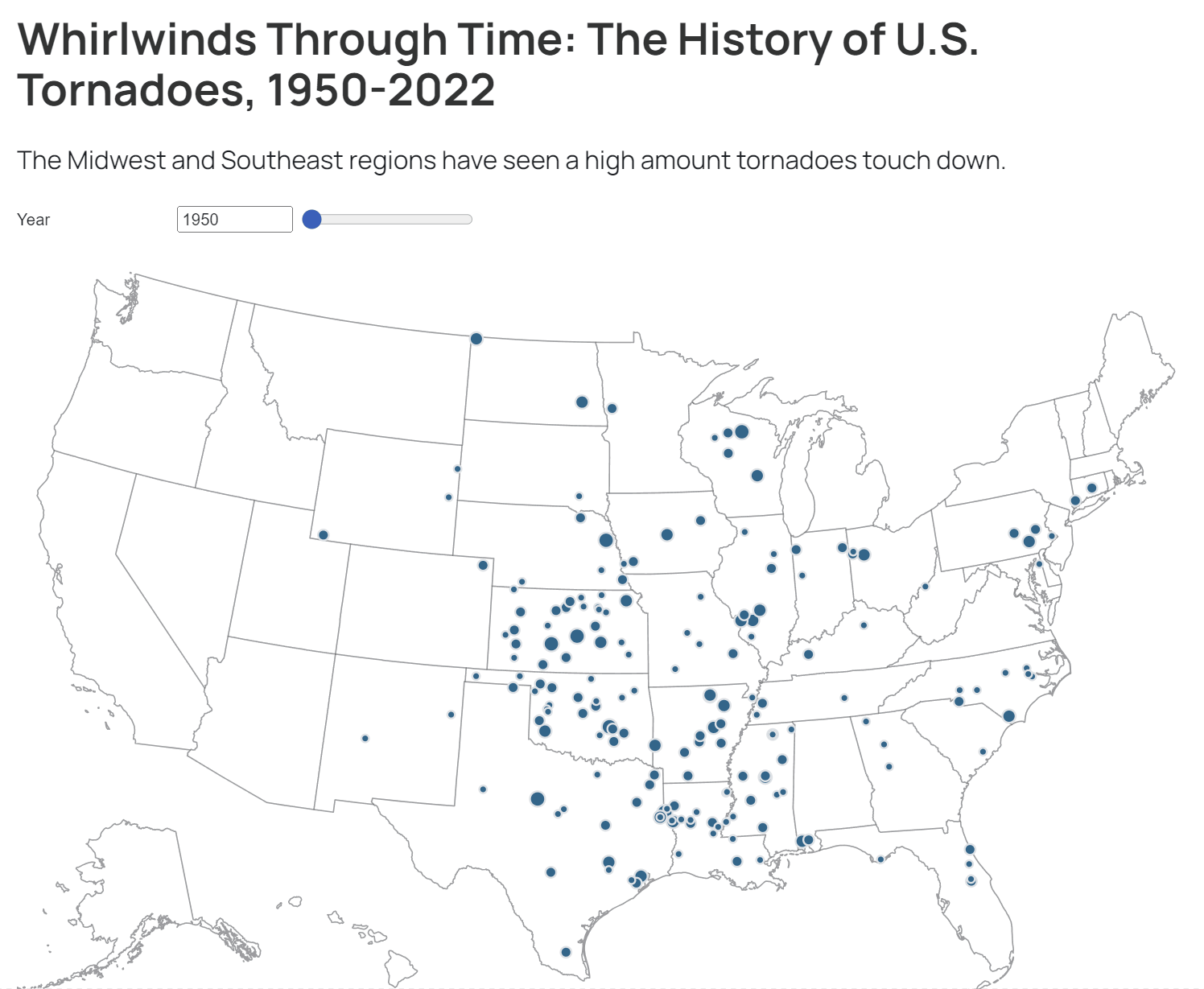
6. Hazards
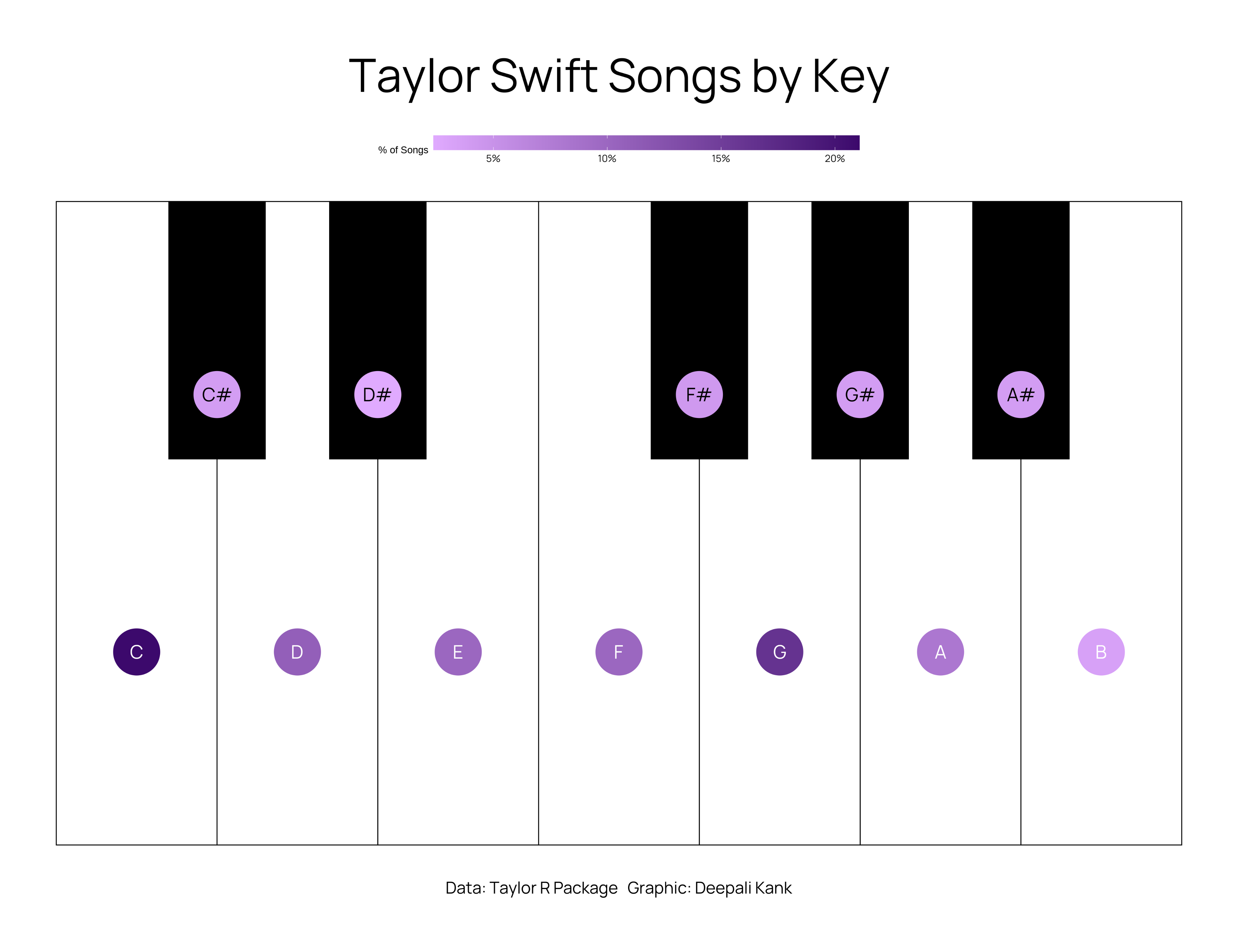
7. Major/Minor
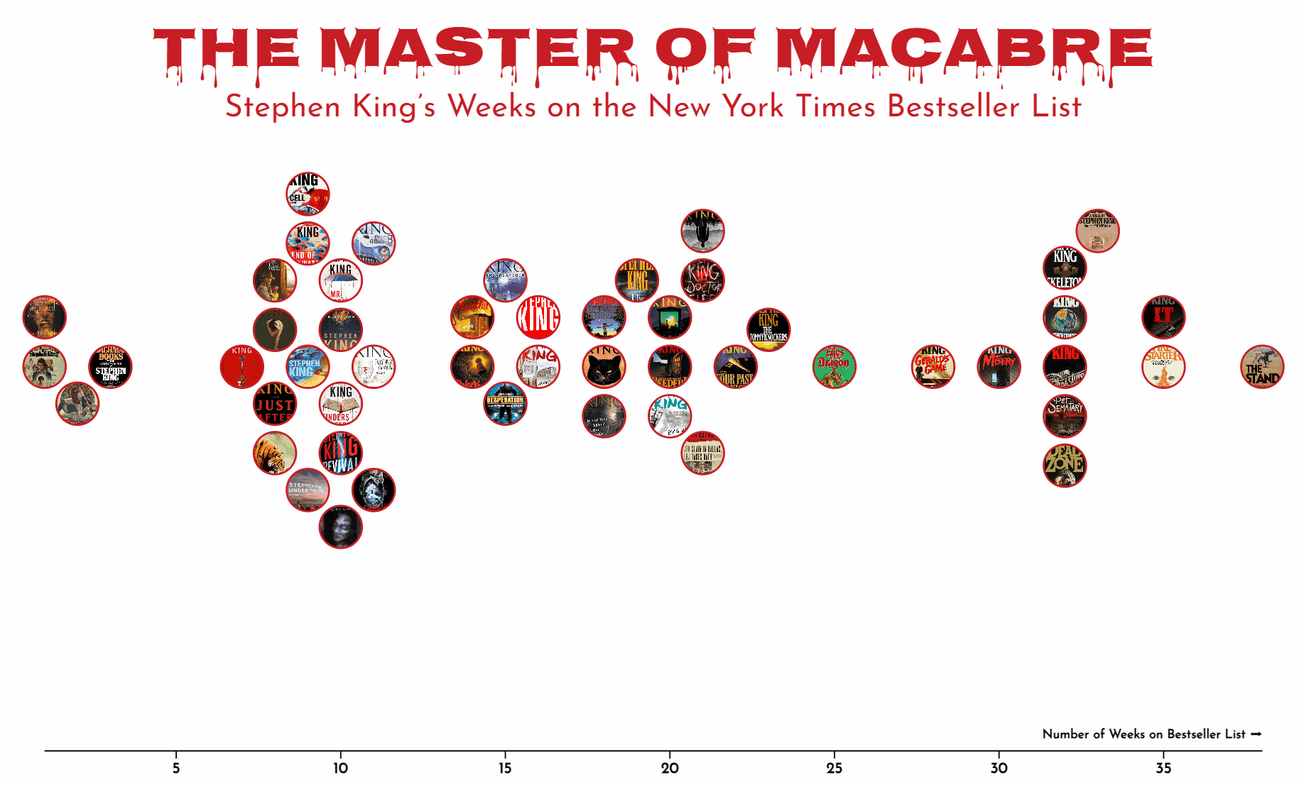
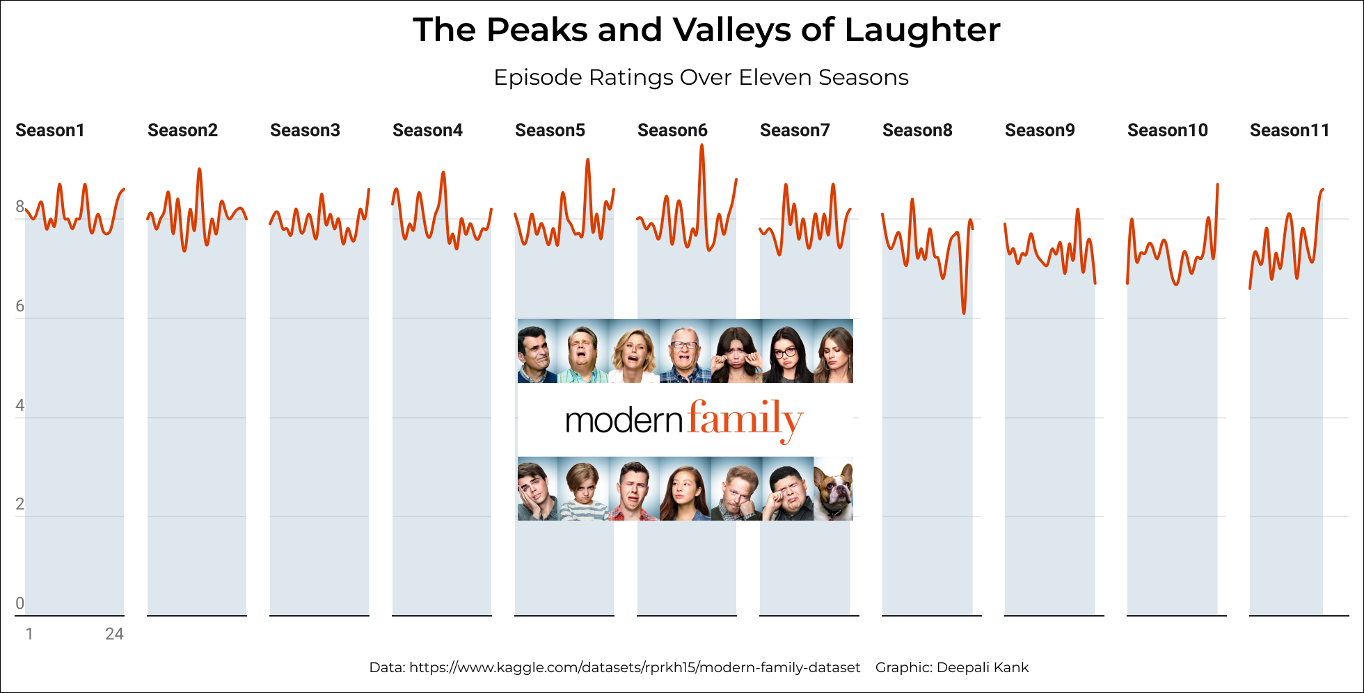
8. Family
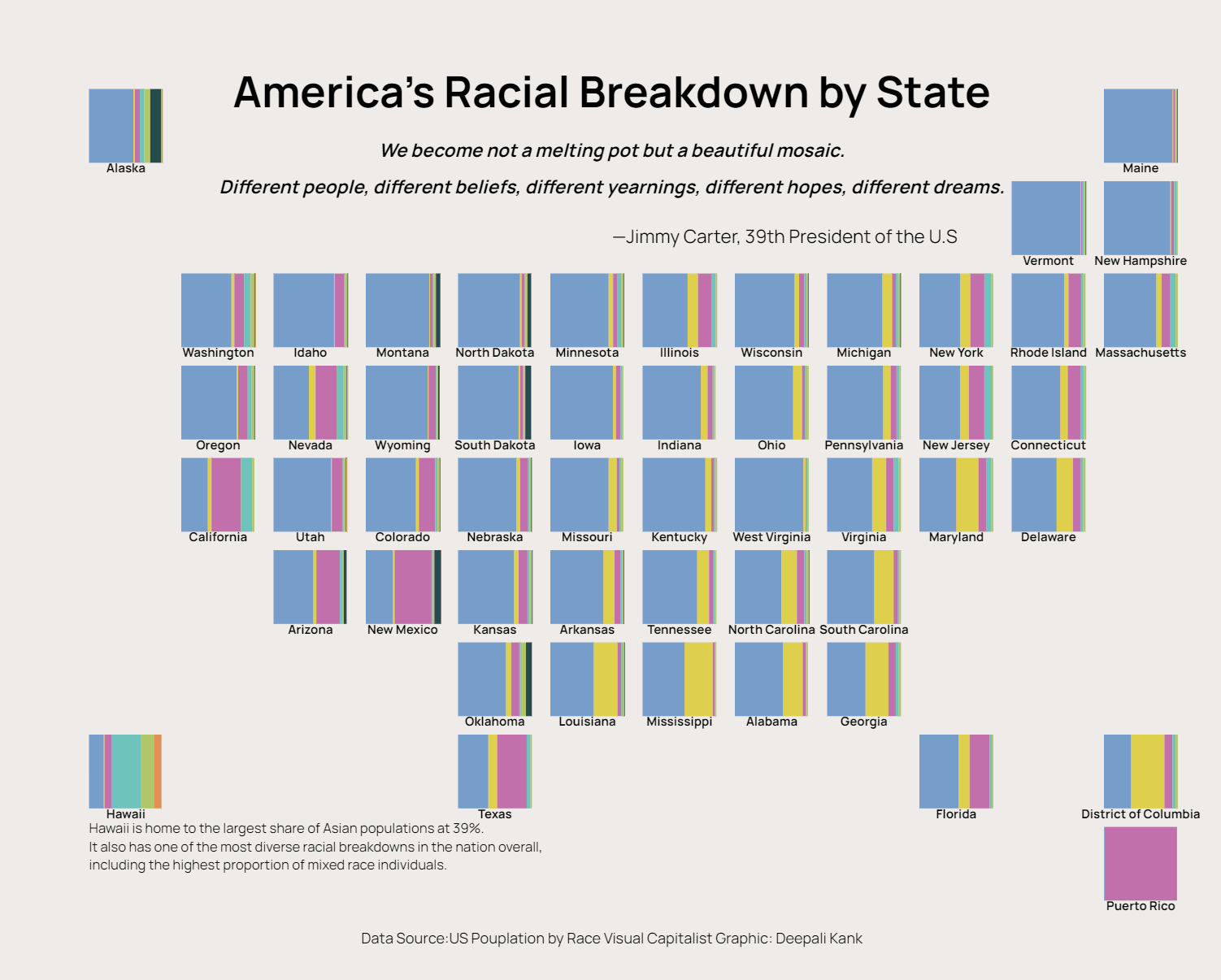
9. Tiles
Challenges and Rewards
It was no mean task, let alone using various tools, but also thinking critically regarding which best fits the representation of the diverse data types. One of the biggest challenges was deciding which tool fits best of the day’s theme and my story; this also quickly became the most rewarding, consuming knowledge of what each tool is capable of or not.
Conclusion
So, the journey through #30DayChartChallenge has been exceptionally enriching. They turned into additional skills, not only technically but also in the artistic and scientific pursuit of data visualization. Shall look forward to applying these insights into my future projects. I highly recommend this challenge to anyone interested in data visualization.
Code for all the Charts: https://github.com/deepdk/30-Day-Chart-Challenge-2024